ZARA
Redesign checkout flow
for guests purchases
Role: UX & UI design


ZARA
Redesign checkout flow
for guests purchases
Zara is one of the world’s most successful “fast fashion” retailers. In this project,
I have decided to redesign their website to make it more functional and simpler to use.
What makes it harder for a guests
to make a quick purchase?
Improve conversion rate with
more users completing the
checkout process
Guest
Users
Scenario
Noa purchased the dress as a guest – she didn’t want to register for a one-time purchase
At the mall, she tried on a few dresses, including at ZARA, but didn’t purchase any
In the end, she decided to buy a dress from the Zara website for the simple fact that she had a Zara voucher
She searched for the dress on-site and examined dresses using the quick look option
Noa purchased the dress as a guest – she didn’t want to register for a one-time purchase
My most significant focus throughout my market research has been on checkout steps for unregistered users.
I compared a range of e-commerce sites to reach the ideal solution and stick to
Zara’s order and shipping methods
What can help users shop faster and checkout easier?
General
navigation
General
navigation
/ Easy navigation with a clear hierarchy and submenus
/Main menu divide into categories
/ Accessible filtering option
/ A quick option to view and add items to the cart
/ Feedback on adding an item to the cart and upsells suggestions
/ Separating favorites from the cart and allowing guests to access favorites
Shopping
Cart
Shopping
Cart
/ Easy scan of all selected items and a clear call to action
/ Allows editing items without leaving the cart
/ “Breaking resistance” with benefits such as free shipping and convenient exchange policies
/ Upselling and complementary products to increase sales
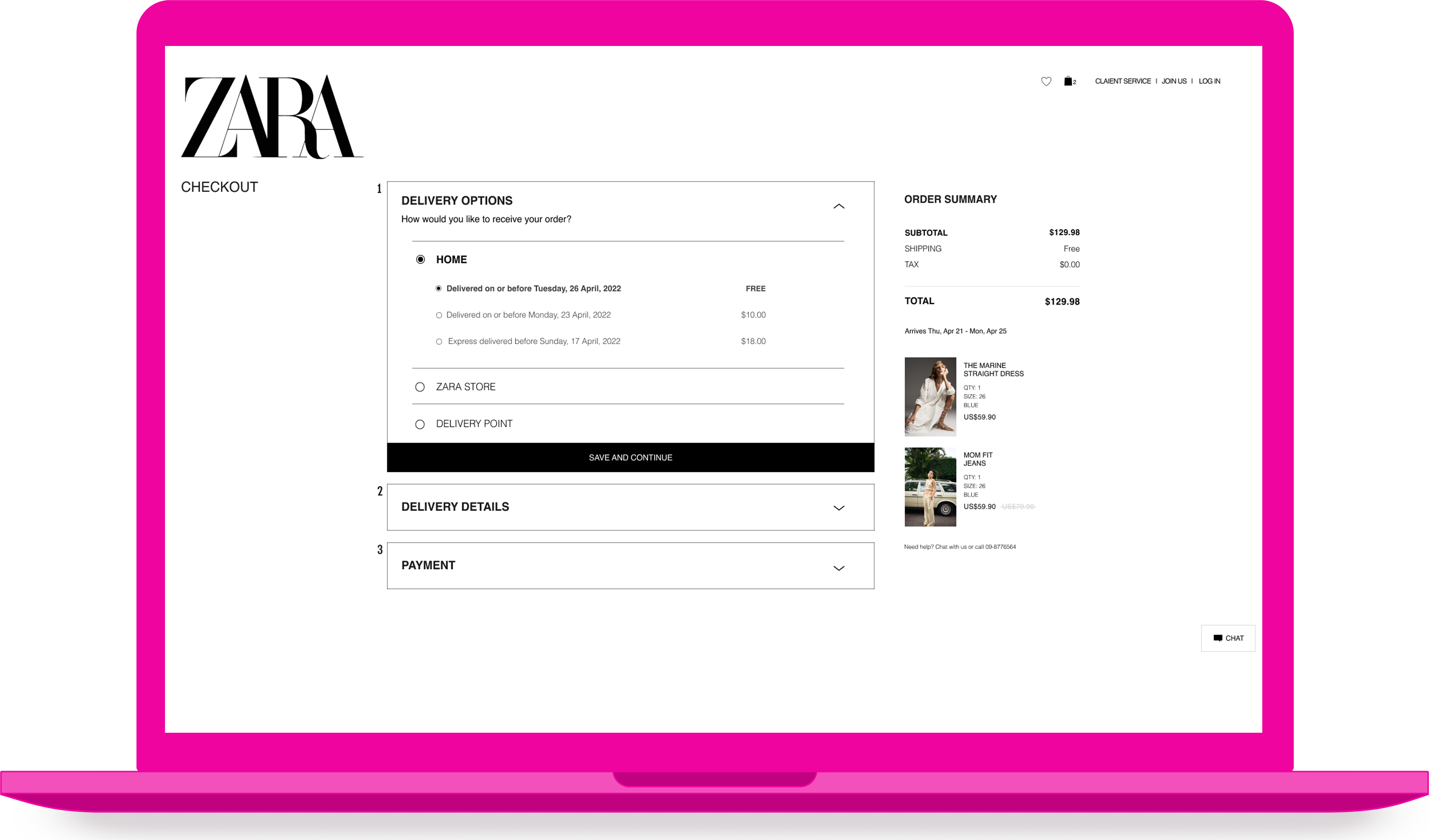
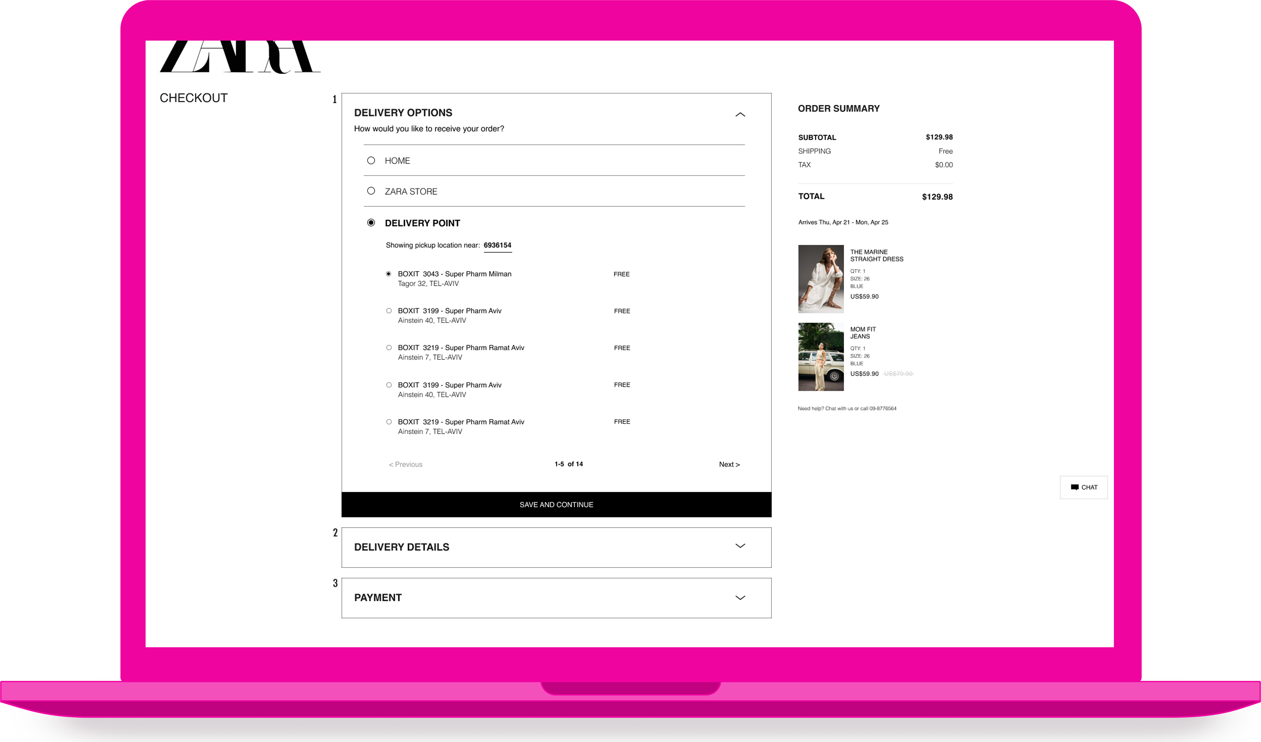
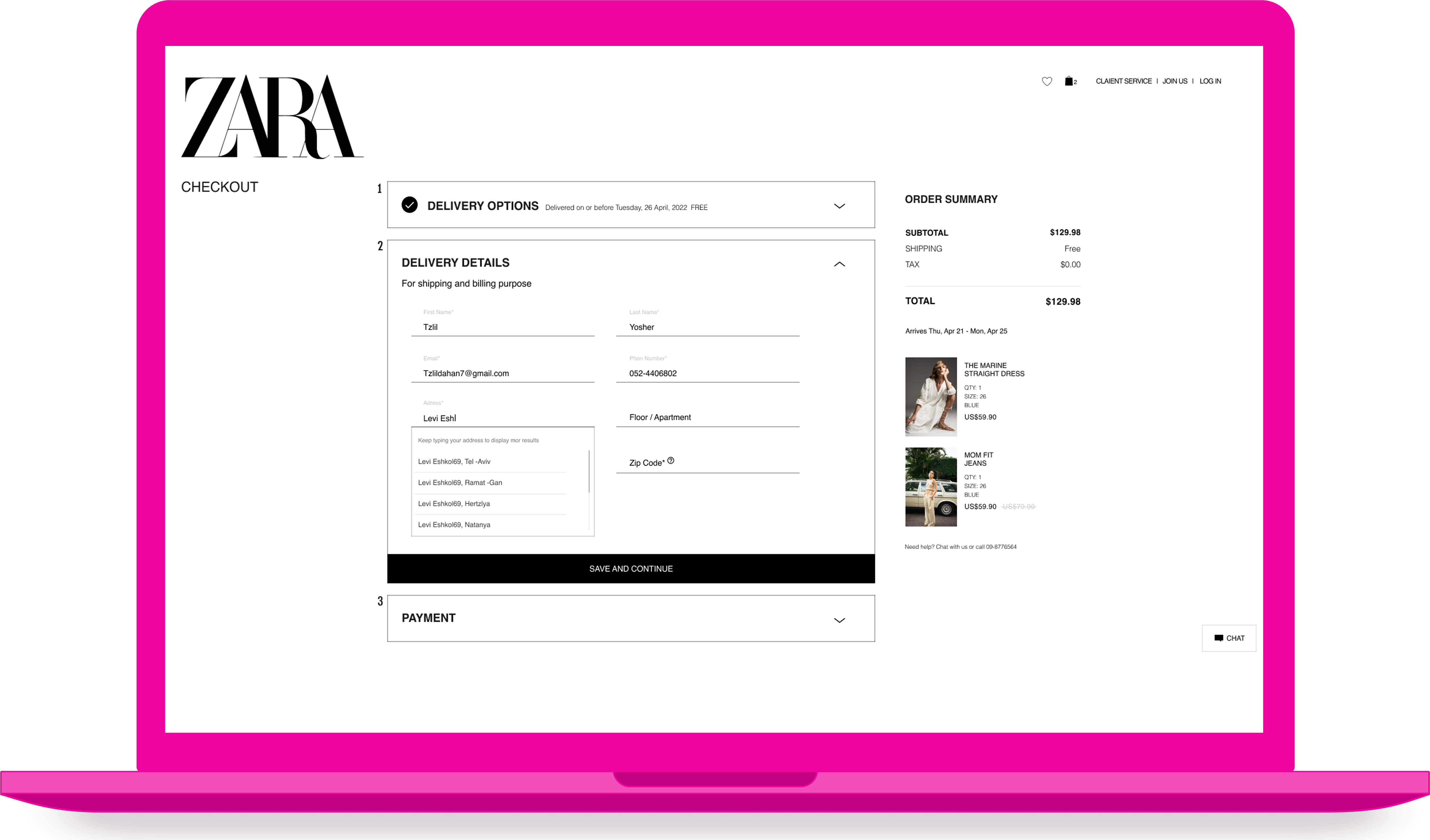
Checkout
Process
Checkout
Process
/ Guests with email identification can continue to make payments
/ Providing a sense of security through a secure payment access
/ Organize short payment steps on one page to provide process orientation
/ Display the mini cart permanently for user comfort
/ Support the payment process by providing assistance
/ Clear microcopy for the process
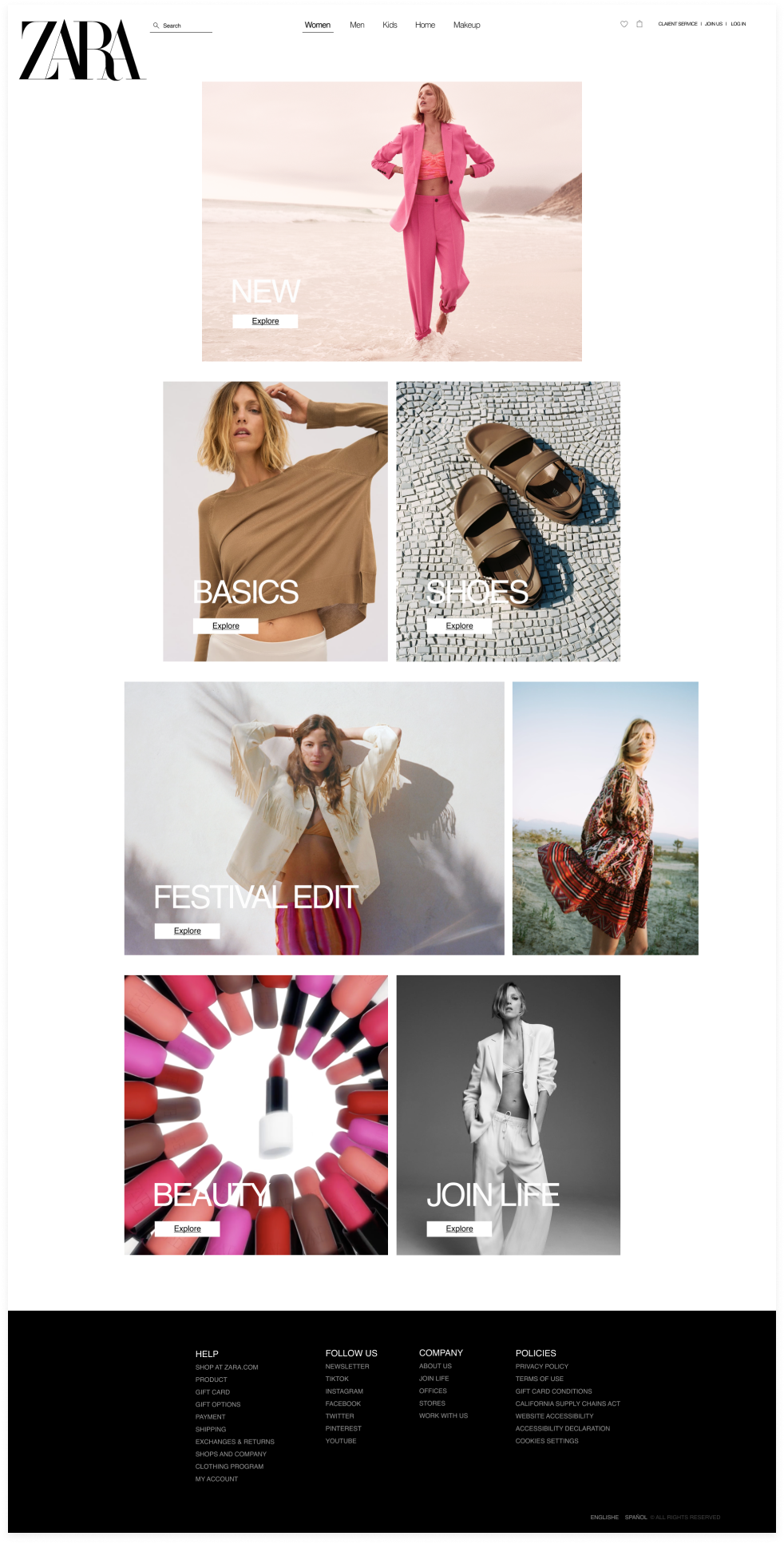
Zara positions itself among haute couture brands while selling fast fashion
People are hesitant to provide personal information
Checkout is the same for members and guests, but member details are automatically filled
The majority of Zara customers shop in stores
As a guest, the user will only need to provide minimal information
For most people, registering on the site is a big commitment
Zara’s website should convey the elegance of haute couture but still be functional
All Zara shipping methods must be considered
Many people don’t like creating new passwords simply because they can’t remember them
The company’s interests are served by registering users, but it should also address the issue of temporary users
As Zara is considered fast fashion, adjust the payment options for casual customers, and provide a quick look at the items
The main goal is to maintain the current language of the Zara site for a more authentic experience